Five years, hundreds of iterations, and the fight to get a brand back to what it was supposed to be.
In 2021, an agency handed us a brand that wasn't ours.
I joined Beekeeper's Naturals in 2021, right as the company had just gone through a rebrand built around a new naming system — B. Better, B. Soothed, B. Immune, and so on across the line. It was meant to be a memorable way to build brand identity. But almost immediately, something felt off. Customers described the look as "cute". It didn't feel like efficacious medicine you could trust. It didn't read as a natural brand backed by serious ingredients. Sales dipped after launch. It wasn't a subtle miss.
The disconnect was clear enough that instead of bringing in another agency for another reset, we decided to build the next iteration from the inside, grounded in what we actually believed the brand should be.
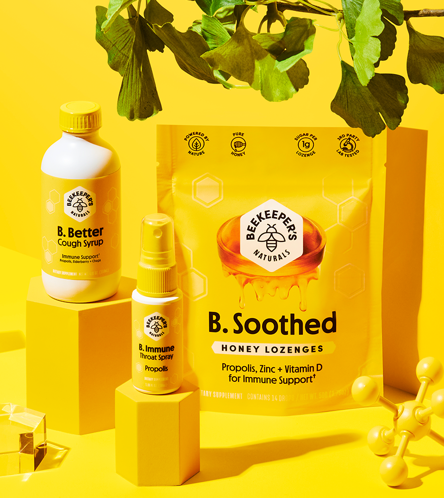
Beekeeper's Naturals agency lead rebrand in 2021After deciding to take the rebrand in-house, we went back to square one. Over the next several months we tried hundreds of iterations before landing on the direction we're building today.

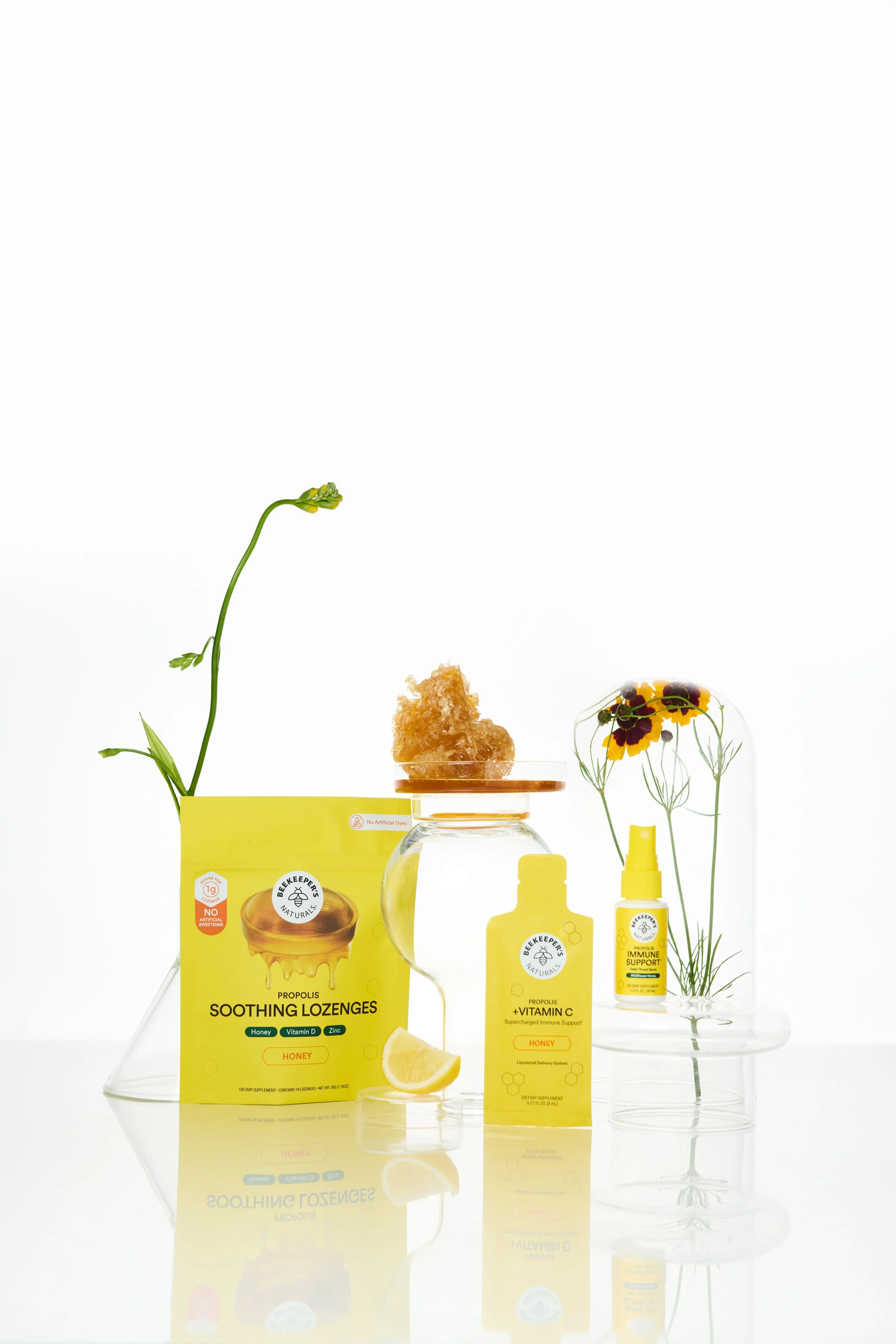
One of the first things we got clear on: our customers didn't need flashy branding. They needed clarity. Propolis, our core ingredient, wasn't common knowledge, people actually needed to learn what it was and why it worked. So we stopped naming products things like B. Better and B. Soothed and started naming them exactly what they were: Immune Support, Cough Syrup, Lozenges. That freed up the space we'd been spending on cute names and put it toward educating people on the ingredient itself.
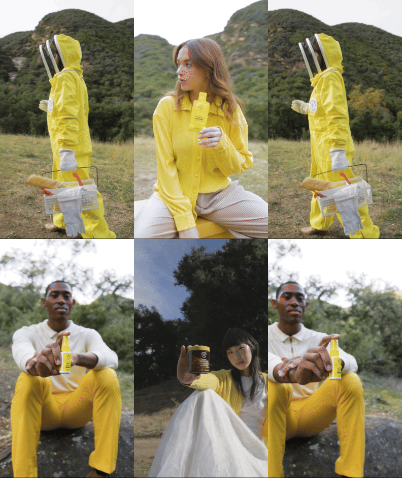
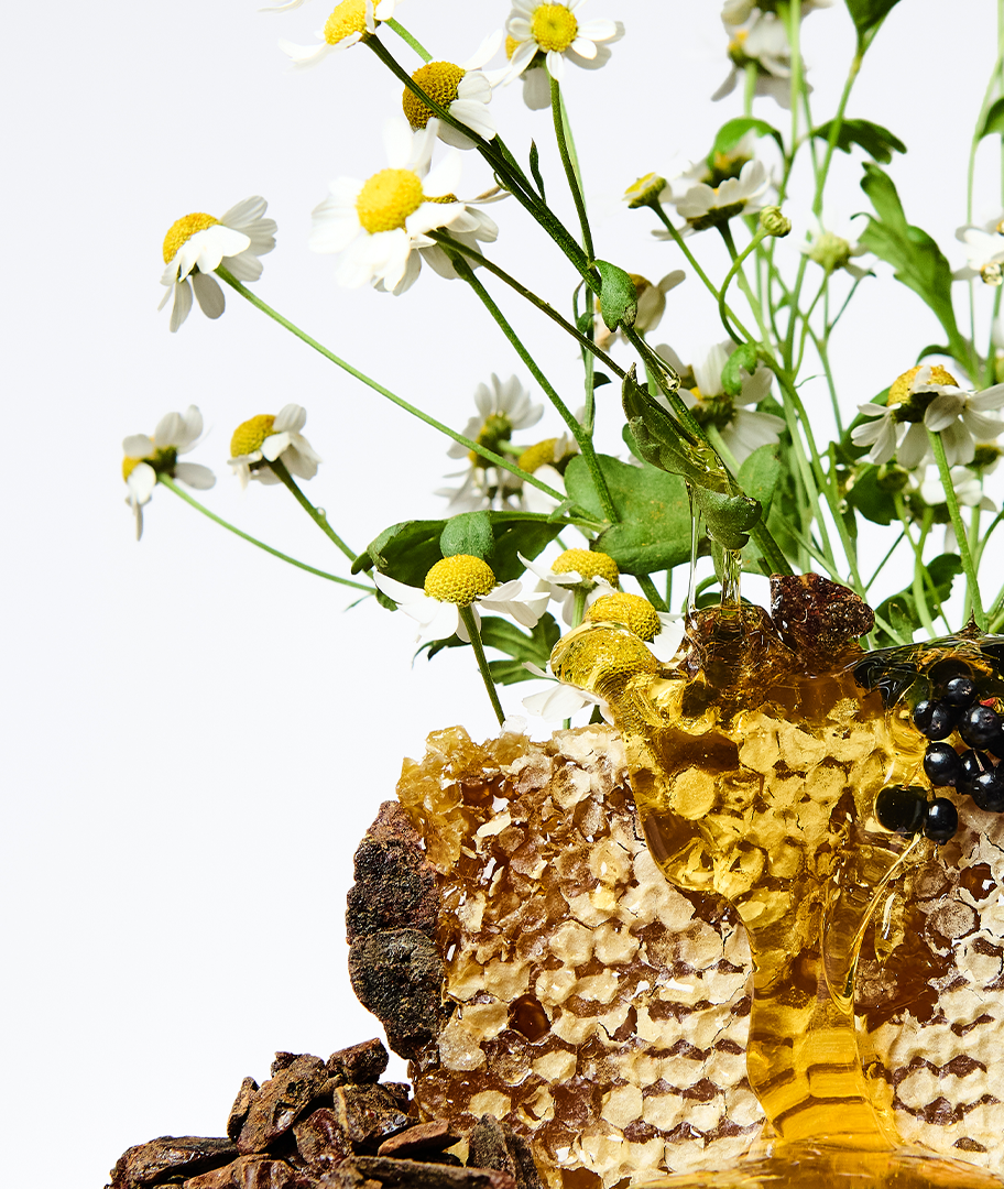
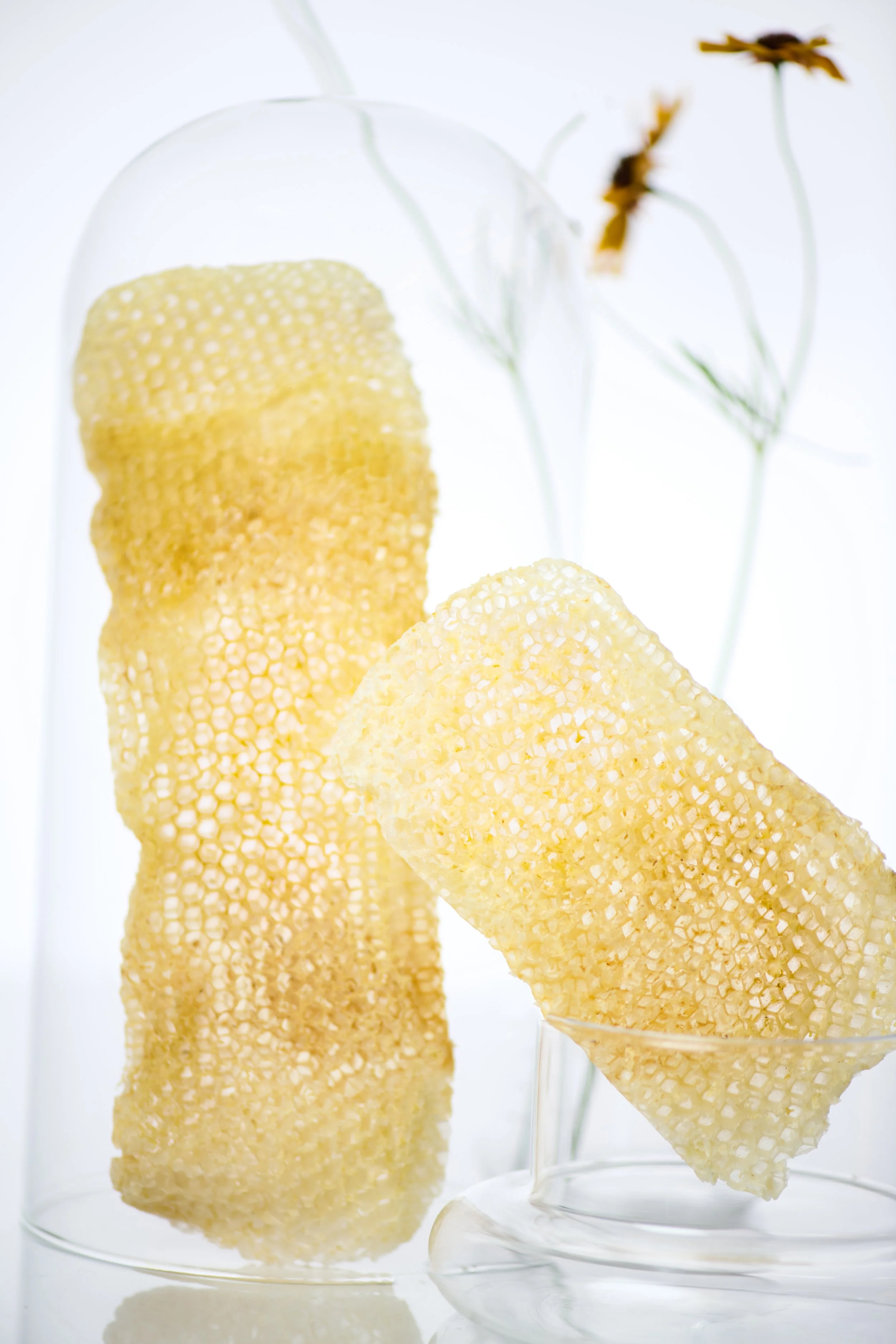
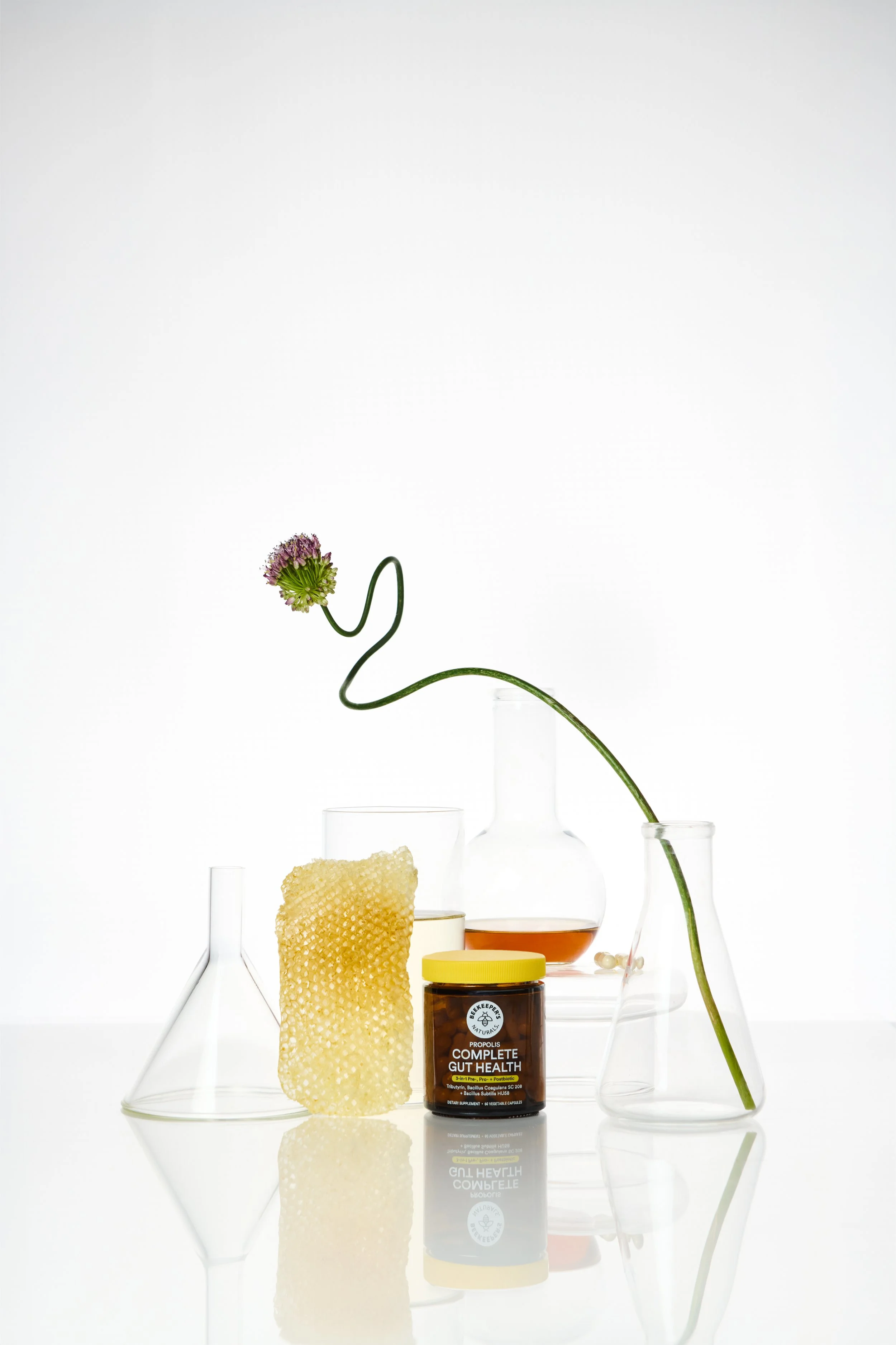
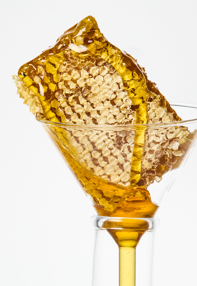
We took the same lens to photography. We didn't want the playful, overly staged DTC look. We pulled things back with more natural elements, focusing on the ingredients themselves instead of elaborate set design.
The goal underneath all of it was to become the elevated wellness brand. Aspirational and inspiring, telling people there's a better way to take care of themselves.
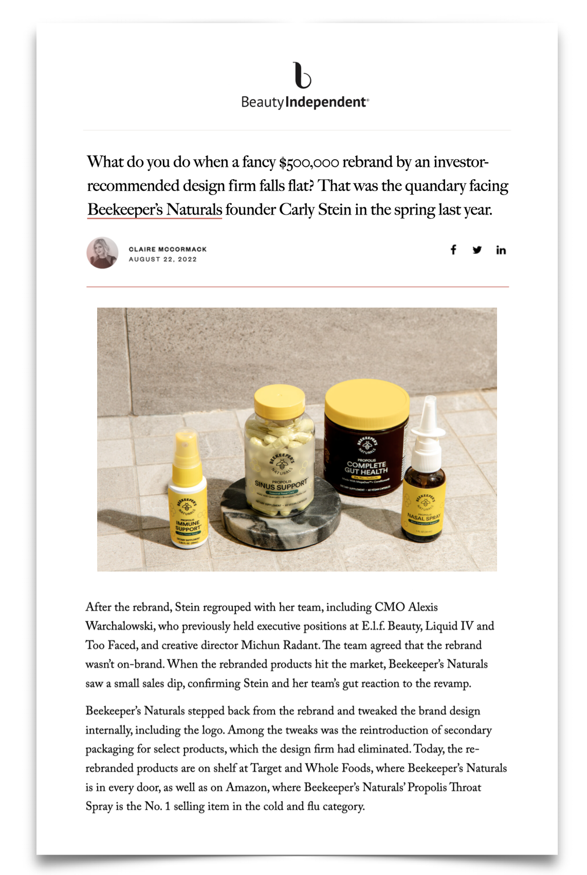
Featured in Beauty Independent, August 2022 — the rebrand-reversal covered in the press.
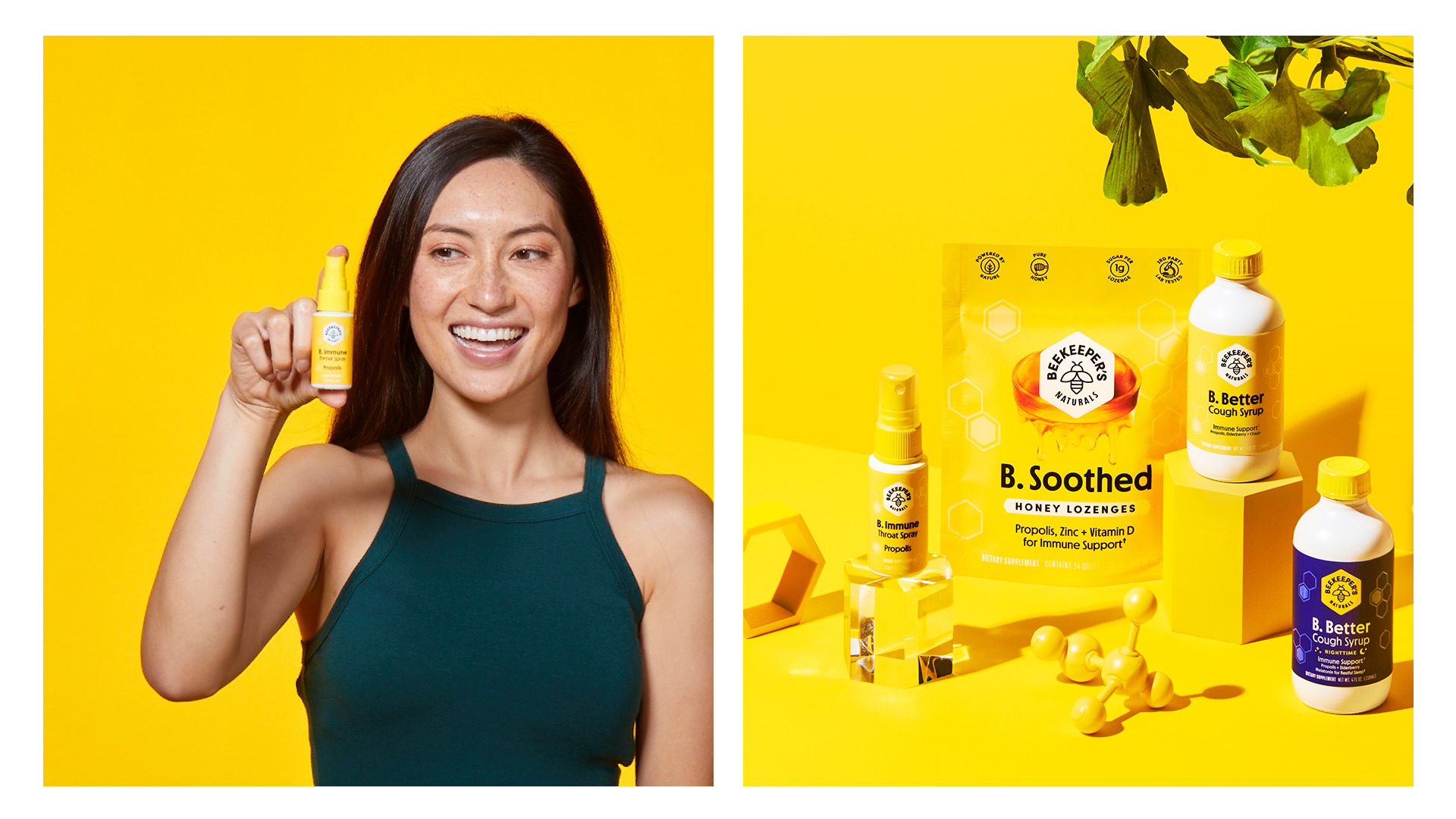
2021 Look & Feel
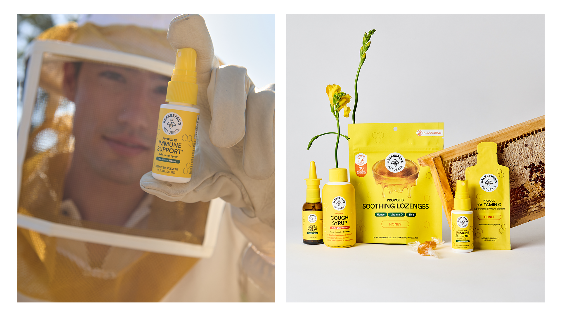
2026 Look & Feel
A brand that never stopped moving
That commitment kept compounding. Over the five years since, the brand has never really stopped iterating.
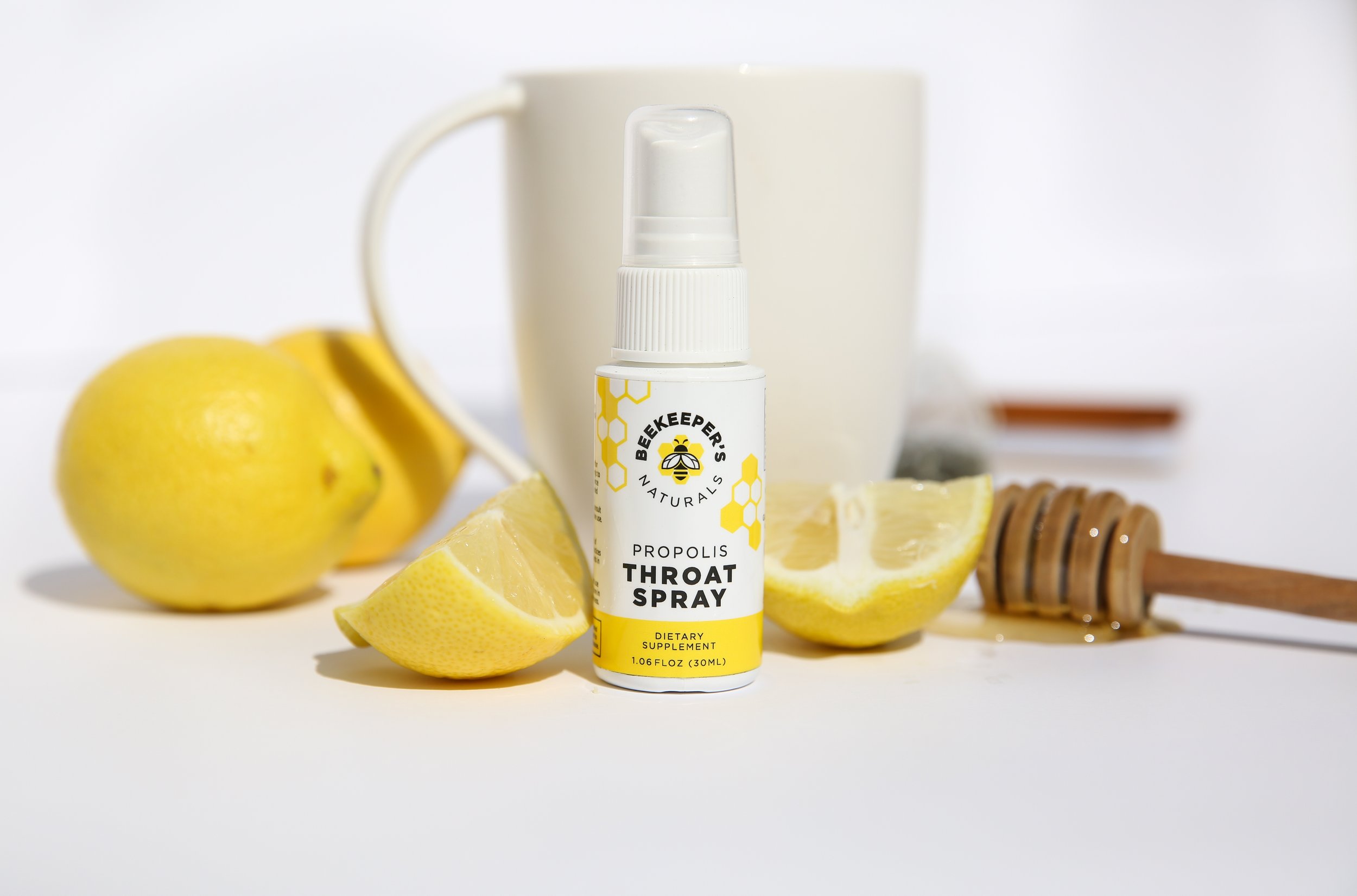
2017
The original Propolis Throat Spray, before the brand identity took shape.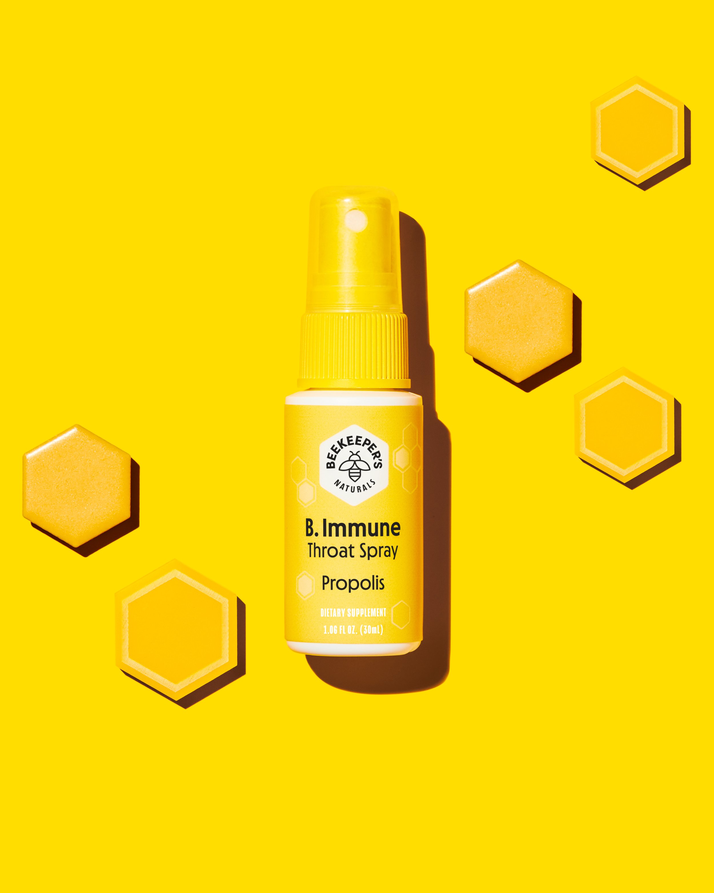
2021
Renamed to B. Immune under the new "B." naming system, with the all-yellow identity starting to take shape.
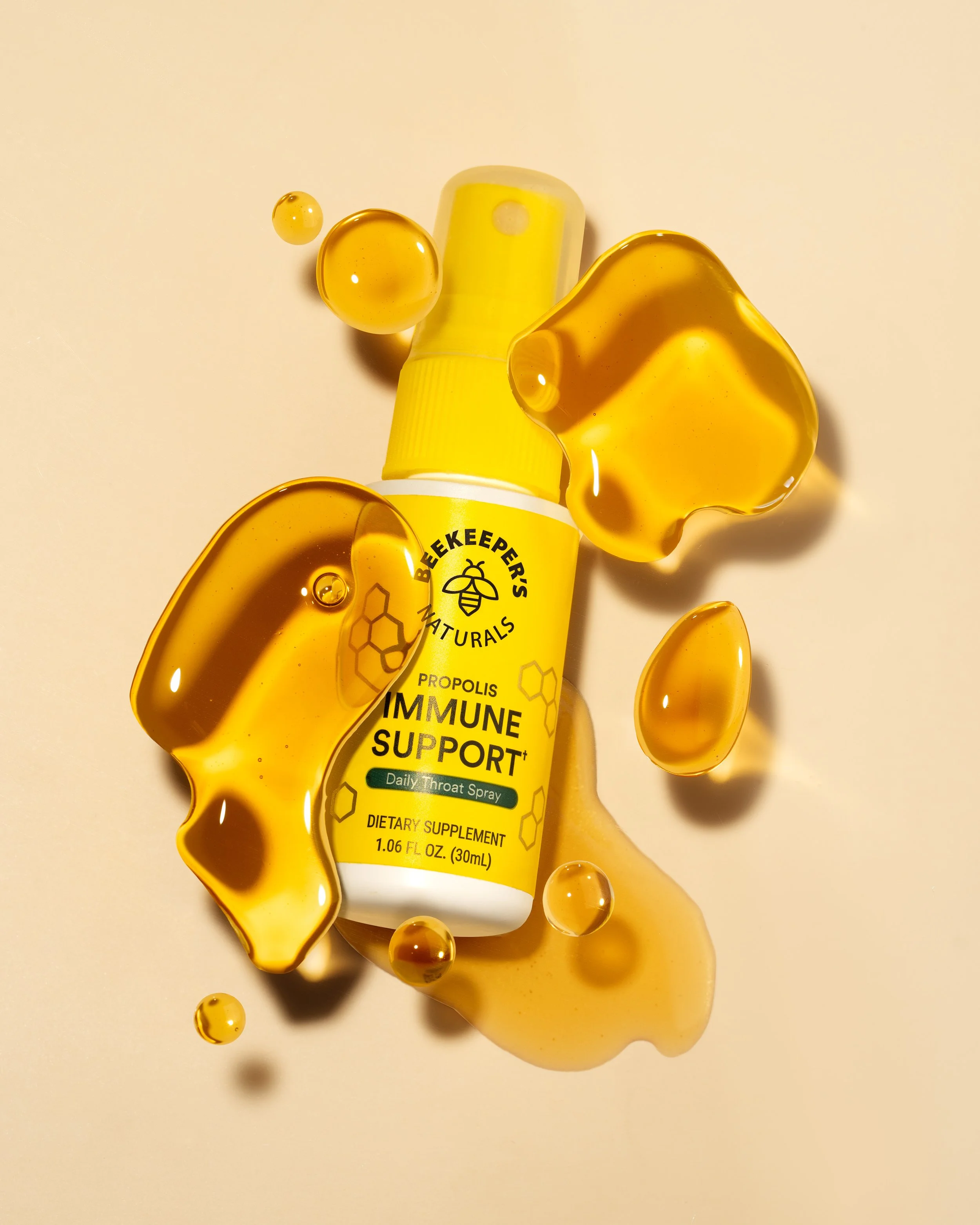
2022
We dropped the cute names and let function lead with a more elevated look built on the same recognizable yellow.
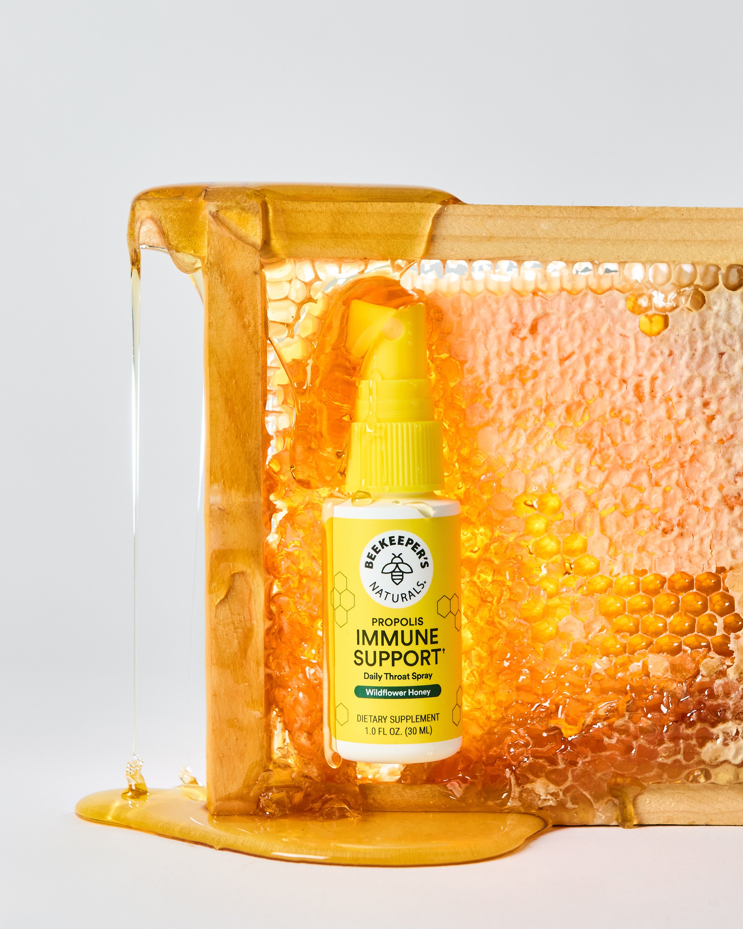
Today
A unified brand mark with a clean white logo circle ties everything together, boosting shelf visibility and brand recognition across the line.
From 11 SKUs to 100+
How do we keep this recognizably one brand while still letting each category say something distinct?
When I started, we had 11 SKUs. Today it's more than 100. Ranging from immune support, gut health, sinus support, cough and cold, brain health, kids' lines, retailer exclusives, to co-branded collaborations.

A gut health supplement needs a different kind of trust signal than a nighttime cough syrup. A retailer-exclusive line needs to feel special without feeling off-brand. A co-branded collaboration needs room for someone else's identity without losing ours.
A lot of my own growth over these five years has been learning to hold all of that at once. Building a system with enough structure to feel like one brand at a glance, and enough flexibility to let each category earn its own space within it. That's less about a style guide sitting in a drawer and more about a set of instincts: what's negotiable, what's sacred, and how to tell the difference fast when a new product needs an answer next week, not next quarter.